Editing
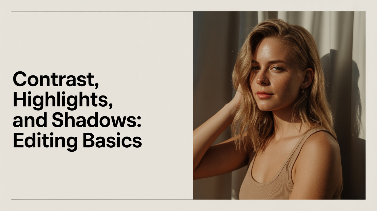
Contrast, Highlights, and Shadows: Editing Basics
Learn how to use contrast, highlights, and shadows sliders in photo editing. A practical tone editing guide for beginners with clear, jargon-free advice.
Most beginner edits fall flat for the same reason: the tones feel wrong. The photo is technically exposed but looks dull, or the bright areas are blown out, or the shadows are so crushed you can't see the detail that was there. The fix almost always lives in five sliders: Contrast, Highlights, Shadows, Whites, and Blacks. This guide explains what each one does and how to move them in a sensible order.
What These Sliders Actually Control
Before you touch anything, it helps to know what each term means.
Contrast is the difference between the bright areas and the dark areas in a photo. High contrast means the brights are very bright and the darks are very dark. Low contrast means everything sits closer to a flat middle grey.
Highlights refers to the brighter parts of your photo, but not the absolute brightest point. Think of a sunlit wall, a pale sky, the lightest part of someone's shirt.
Shadows are the darker areas, but not the absolute darkest. The underside of a table, the inside of a jacket hood, the shaded side of a face.
Whites controls the absolute brightest point in the image. A clear sky, a white wall in direct sun, a specular reflection on glass.
Blacks controls the absolute darkest point. Deep shadows with no detail, black fabric, the inside of a lens barrel.
Clipping is what happens when tones go too far in either direction. Blown highlights clip to pure white with no detail. Crushed blacks clip to pure black with no detail. Both are usually something you want to avoid.
These five sliders exist in Lightroom Classic, Lightroom mobile, Adobe Camera Raw, Capture One, and most other serious editing apps. The exact names may differ slightly between app versions, so confirm against your editor's current documentation.
How to Use Contrast in Editing
The Contrast slider is tempting to reach for first because it has an immediate visible effect. A big boost makes everything look punchier and more dramatic. The problem is that it's a blunt instrument: it lifts the highlights and crushes the shadows all at once, without letting you control them separately.
A good approach is to leave Contrast alone at the start and use the individual tone sliders instead. Once Highlights, Shadows, Whites, and Blacks are set where you want them, you may find you don't need the Contrast slider at all. Or you might nudge it by +10 to +20 to add a little overall punch. Large moves on Contrast alone tend to clip both ends at once.
One exception: if you shot in RAW format, your file will look flatter than the JPEG preview you saw on camera. A modest Contrast boost of +15 to +25 is often needed just to get back to a natural starting point. This is less about creative choice and more about recovering what the camera's internal processing normally applies. If you're not sure whether you should be shooting RAW or JPEG, the article Raw vs JPEG: Which Should Beginners Shoot covers that decision in detail.
Highlights and Shadows: What Order to Work In
For most photos, this sequence works well.
1. Pull Highlights Down
Start by dragging Highlights to the left, usually somewhere between -30 and -70. This recovers texture in bright areas that might otherwise look washed out. On an overcast day you may only need -20. On a sunny day with a bright sky, you might push it to -80 or -90. Stop when you can see detail in the bright areas without them looking grey and muddy.
2. Lift Shadows Up
Push Shadows to the right, usually +20 to +60. This opens up the dark areas and lets you see what's hiding in the shade. Portrait shadows, details in dark clothing, and texture on shaded surfaces all benefit. Be careful not to push too far: heavy shadow lifting reduces contrast and can make skin tones look flat or washed.
3. Set the Whites
The Whites slider sets where true white falls in your image. Hold Alt (Windows) or Option (Mac) while dragging this slider and your screen will go black. As you drag right, white areas will appear showing where clipping starts. Pull back just until those areas disappear, and you've set the brightest possible white without losing detail. If your editor doesn't support this preview, drag right slowly until the brightest areas look clean but not blown.
4. Set the Blacks
The same technique works for Blacks, but in reverse. Hold Alt/Option and drag the Blacks slider left. This time the screen goes white, and dark areas appear as you drag. The goal is usually to have a small amount of pure black in the image, which gives the photo visual grounding. Drag left until you see just a tiny cluster of dark areas in the blackest part of the scene, then stop.
5. Fine-Tune Contrast
After those four sliders are set, look at the overall result. If the image still feels flat, add a small amount of Contrast (+10 to +25). If it feels harsh, bring Contrast down slightly or back off on the Whites or Blacks adjustments.
This five-step order is part of a broader editing process. If you want a full workflow from import to export, A Simple Photo Editing Workflow for Beginners walks through every stage.
A Quick Reference: What Each Slider Does
| Slider | Controls | Drag Right | Drag Left |
|---|---|---|---|
| Contrast | Overall bright-to-dark gap | More dramatic, punchier | Flatter, softer |
| Highlights | Upper-mid tones | Brighter highlights | Recover bright detail |
| Shadows | Lower-mid tones | Open up dark areas | Deeper, moodier shadows |
| Whites | Absolute brightest point | Brighter ceiling | Lower the white point |
| Blacks | Absolute darkest point | Lift the floor, faded look | Deeper blacks, more crush |
These adjustments combine with exposure and white balance to form the foundation of tone editing basics. If your image still looks off after working through these sliders, check exposure and white balance first. Those are the more likely culprits. The guide How to Fix Exposure and White Balance in Editing covers that step.
Common Mistakes and How to Avoid Them
Boosting contrast as the first move. The result looks good immediately, but you've given up control of the highlights and shadows separately. Start with the individual sliders.
Lifting shadows too far. When shadows go above +70 or +80, the photo often develops a milky, faded look. That style can be intentional, but if you're going for a natural result, stop around +50.
Ignoring the Whites and Blacks sliders. Many beginners only use Highlights and Shadows, but those sliders affect the mid-bright and mid-dark tones respectively. Whites and Blacks set the true endpoints. Using all four gives you much more precise control.
Clipping highlights on purpose. A bright sky going pure white feels natural in some situations, but most of the time you're losing real texture and information. The histogram in your editor shows clipping clearly: a spike against the right edge means blown highlights.
Frequently Asked Questions
What's the difference between Highlights and Whites?
Highlights affects the upper-mid tones in your image: bright but not the absolute brightest. Whites sets where the absolute ceiling of brightness falls. Pulling Highlights down to -60 recovers detail in a bright sky while Whites controls whether the very tip of that sky clips to pure white. They work together, not independently.
Should I always pull Highlights down and push Shadows up?
Not necessarily. That's a common starting point because it tends to recover detail in both directions, but the right move depends on the photo. A silhouette shot is intentionally dark. A high-key portrait intentionally has bright, airy tones. Think about what the photo needs rather than following a fixed rule.
How do I know if I've clipped my highlights?
Most editing apps show a clipping warning. In Lightroom, press J to toggle clipping indicators: blown highlights appear as a red overlay, crushed blacks appear blue. You can also watch the histogram: a spike hard against either edge means clipping at that end.
Does the Contrast slider affect skin tones?
It affects every part of the image. If you boost Contrast heavily on a portrait, skin tones will shift: midtones will move slightly away from grey, and areas near the highlights or shadows will push further toward their extremes. For portrait work, most photographers prefer to set Contrast conservatively and do fine-tuning with the Tone Curve instead.
Why does my RAW file look flat before I edit it?
Cameras apply sharpening, contrast, and saturation internally when they create a JPEG. With a RAW file, that processing is stripped away and you start from the raw sensor data, which looks flatter by design. This isn't a problem; it gives you more room to make your own choices. A small Contrast boost and some Highlights/Shadows work is usually enough to get back to a realistic starting point, and from there you can go wherever you want.